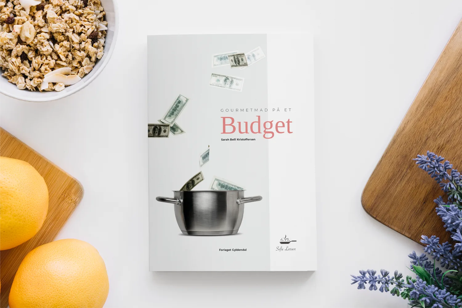
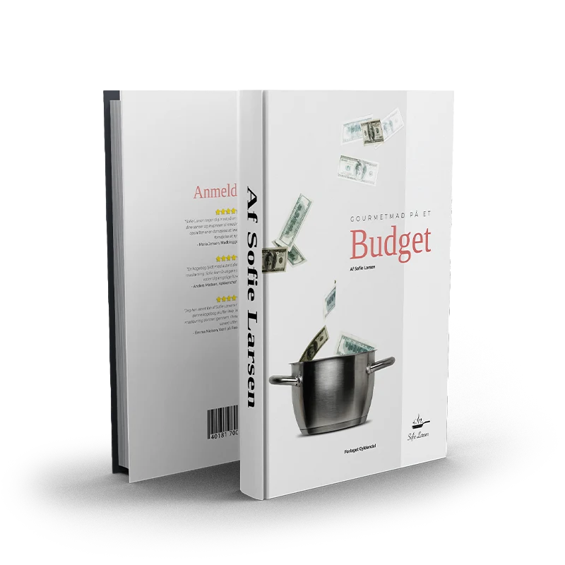
Case - Cookbook
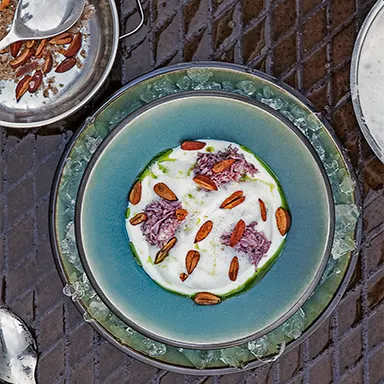
This case presents a visual concept for a gourmet cookbook design that blends modern aesthetics with everyday accessibility. The project was developed as a 24-page prototype and explores how gourmet recipes can be beautifully presented without feeling out of reach—financially or visually.
The core idea behind the cookbook was simple: what if we could make gourmet cooking feel stylish and affordable? What if the pages reflected the elegance of fine dining, but kept the tone friendly, warm, and practical for readers cooking at home on a budget? With that in mind, I set out to create a gourmet cookbook design that celebrates great food and thoughtful design in equal measure.
The Idea Behind the Cookbook
When starting this project, I knew I wanted to strike a careful balance between two worlds: the exclusivity and refinement of gourmet cuisine, and the everyday reality of readers who want to cook great meals without spending a fortune. The concept was built around making the experience of reading a cookbook feel just as enjoyable as the recipes themselves.
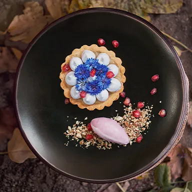
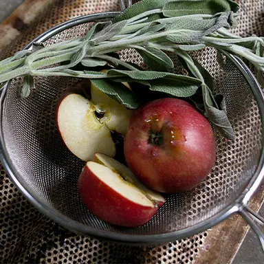
The 24-page prototype showcases how high-end recipes can be framed within a layout that feels light, inspiring, and joyful—never intimidating or over-designed. The tone had to feel personal yet elegant, inviting but still polished.
I also made a conscious choice to integrate the “budget” aspect in a way that didn’t dominate the experience. Rather than shouting about affordability, the design gently signals accessibility through smart layout choices, thoughtful typography, and a sense of ease throughout the visual flow. My aim was for readers to feel like they could actually use this cookbook—without needing a Michelin-star kitchen or a long grocery list.
Web Design
Magazine & Editorial Design
Social Media Graphics
Advanced Image Editing
Print Design
Branding & Visual Identity
Web Design
Magazine & Editorial Design
Social Media Graphics
Advanced Image Editing
Print Design
Branding & Visual Identity
Design Choices


The Layout
The cookbook layout was designed with clarity and warmth at its core. I wanted every spread to feel carefully composed but never rigid—there’s room to breathe, space to focus, and a rhythm that carries the reader from page to page.
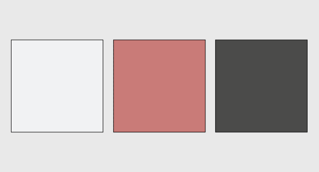
I used a clean grid system to establish structure and consistency, allowing each recipe to follow a clear format while still giving room for variation and personality. Typography plays a big role here: elegant but readable fonts create a sense of style, while section headings and recipe steps remain easy to follow at a glance.
Color accents are soft and supportive—there to guide the eye and enhance the experience, not to take over. I also added subtle icons and visual cues throughout, helping readers navigate without needing to overthink. From recipe pages and intro spreads to feature articles and small visual extras, everything works together to create a book that feels cohesive, curated, and calm.
Curious to see how it turned out? Download the PDF here.
Reflection
Designing this cookbook was both a creative exercise and a personal joy. It brought together so many of my interests—typography, layout systems, storytelling, and of course, food—and challenged me to make something that felt tactile and real.
Through this project, I learned how powerful good layout can be in shaping how people interact with content. I saw how visual hierarchy, tone, and pacing all come together to support the feeling of a book—not just how it looks, but how it reads, how it invites you in, and how it keeps you turning the pages.
More than anything, this project reminded me how design can add meaning to everyday experiences. A cookbook isn’t just a tool—it’s something people hold in their hands, mark up with notes, and return to again and again.